Too Faced Rebrand. Through rebranding Too Faced, I aimed to offer an inclusive and empowering shopping experience, while providing customers with the transparency they need to confidently shop. Most importantly, I examined current procedures, and placed sustainability measures at the forefront of the mission moving forward.

Project Details
Goal: Selected a brand of my choosing and thoroughly conducted research on the industry as well as the brands current procedures. From my findings, I aimed to conduct a rebrand that was driven by sustainability. The final solution took the form of a proposal deck with rebrand assets and a brand guidelines book.
Timeframe: Semester Long Project
Solo Project
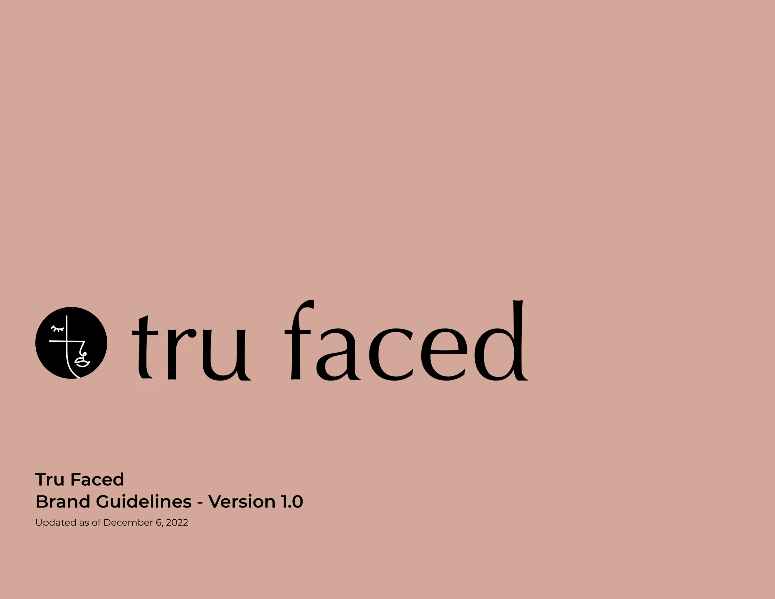
Too Faced Rebrand Proposal
Introducing Too Faced


Too Faced was founded in 1998 by Jerod Blandino and Jeremy Johnson. The brand is now under Estee Lauder.
Too Faced is a brand with the cosmetic industry, primarily selling makeup products.
They gained popularity through their viral and trendy products. Most of these products have a playful childhood fantasy aesthetic.
Research Phase

My SWOT analysis was the result of both secondary and primary research that I conducted. This entailed target audience interviews where I uncovered consumers feelings towards Too Faced, as well as digging into the current Too Faced mission on their existing website.
My findings gave me a direction to pursue through the rebrand. My goals moving forward were to increase inclusiveness by widening the target audience through representation in the brand imagery, build a transparent brand identity that will foster trust, and provide more options for sustainable and organic products.

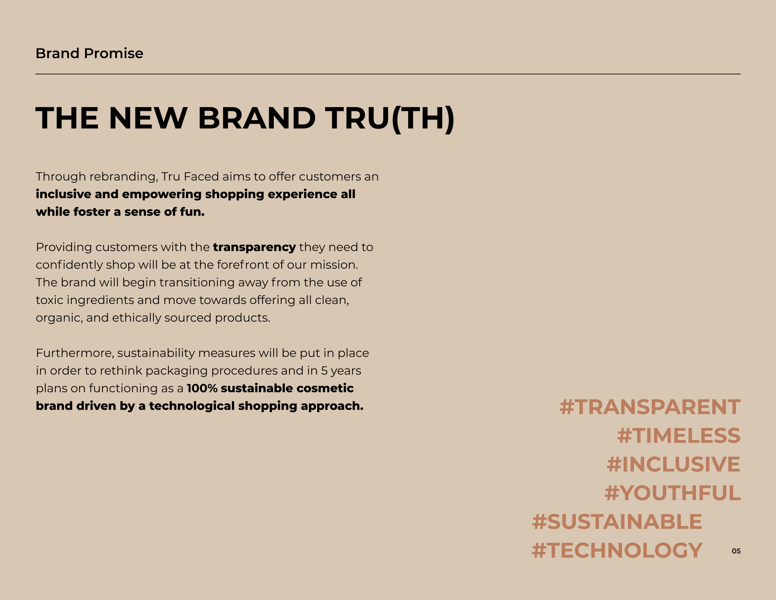
Brand Promise
The brand promise articulated my goals coming out of the research phase into a more clear vision.

Brand Story
Creating my target audience persona helped me tell the new brand story and reminded me to keep everything centered around who I was solving the problem for.
In introducing the new brand identity, understanding the new brand values is crucial. The left side of the deck shows how Too Faced is currently falling short, and the right side shows examples of brands that accomplish the value successfully.
Transparency is the first value to highlight as it plays a crucial role in building trust with consumers. Through rebranding, Too Faced will transform into a brand that provides transparent and accessible information on things like ingredients and sustainability.


In the cosmetic industry, brands that thrive the most do so because they feel timeless. To increase the consumer base, decluttering the hectic, loud, and busy branding to create a more timeless product was important. A sense of timelessness also recalls brand trust and reliability.
Finally, Too Faced currently feels youthful in a childhood fantasy manner and I wanted to keep this core value, but find a happy medium that would match the timeless feeling as well.

This quote by Too Faced was ultimately my guiding principle. It felt obvious that this mission was not being accomplished by the current branding just by glancing at their website and products. The brand did not feel serious at all and the fun aspects felt hectic.

Brand Identity
With this background, I created 3 different versions of the BI.
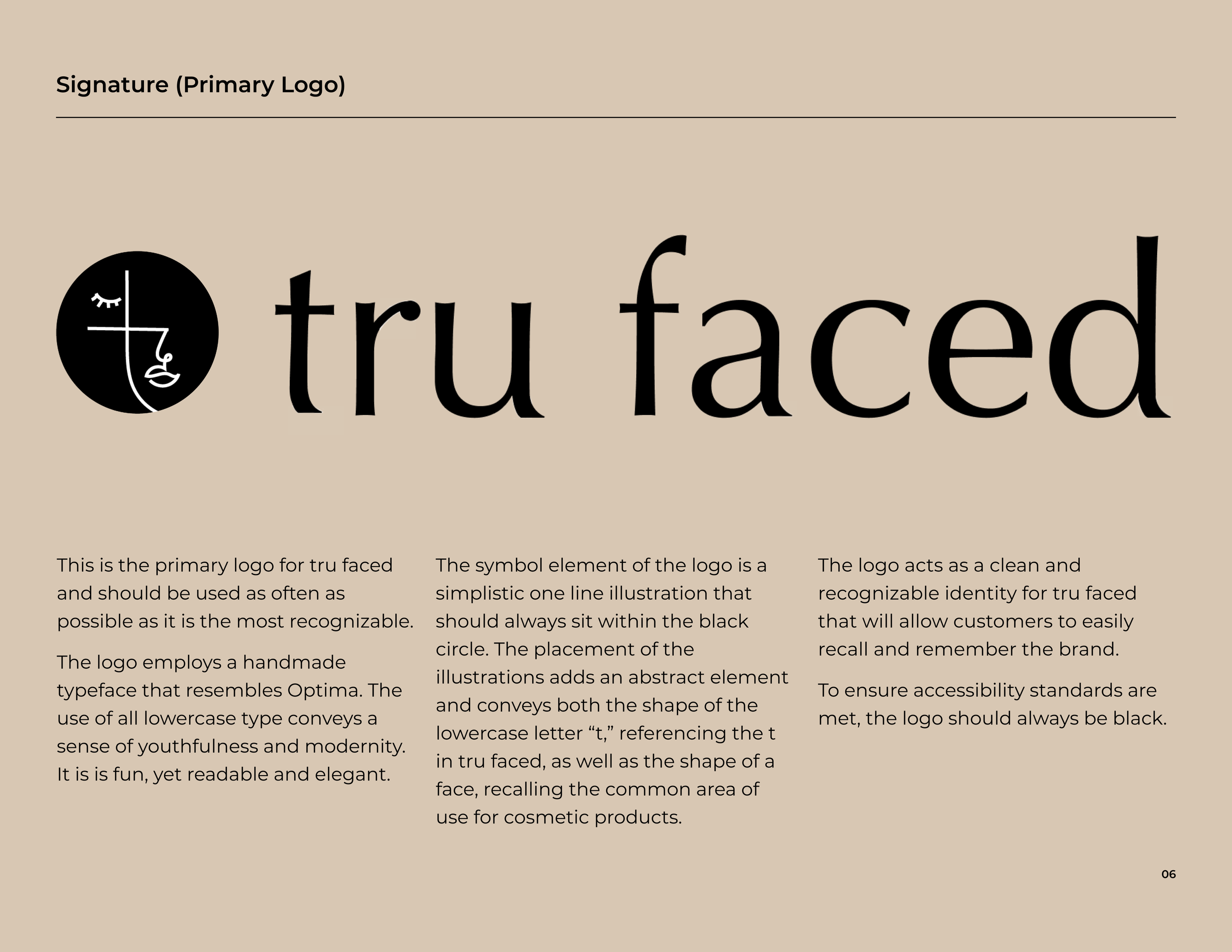
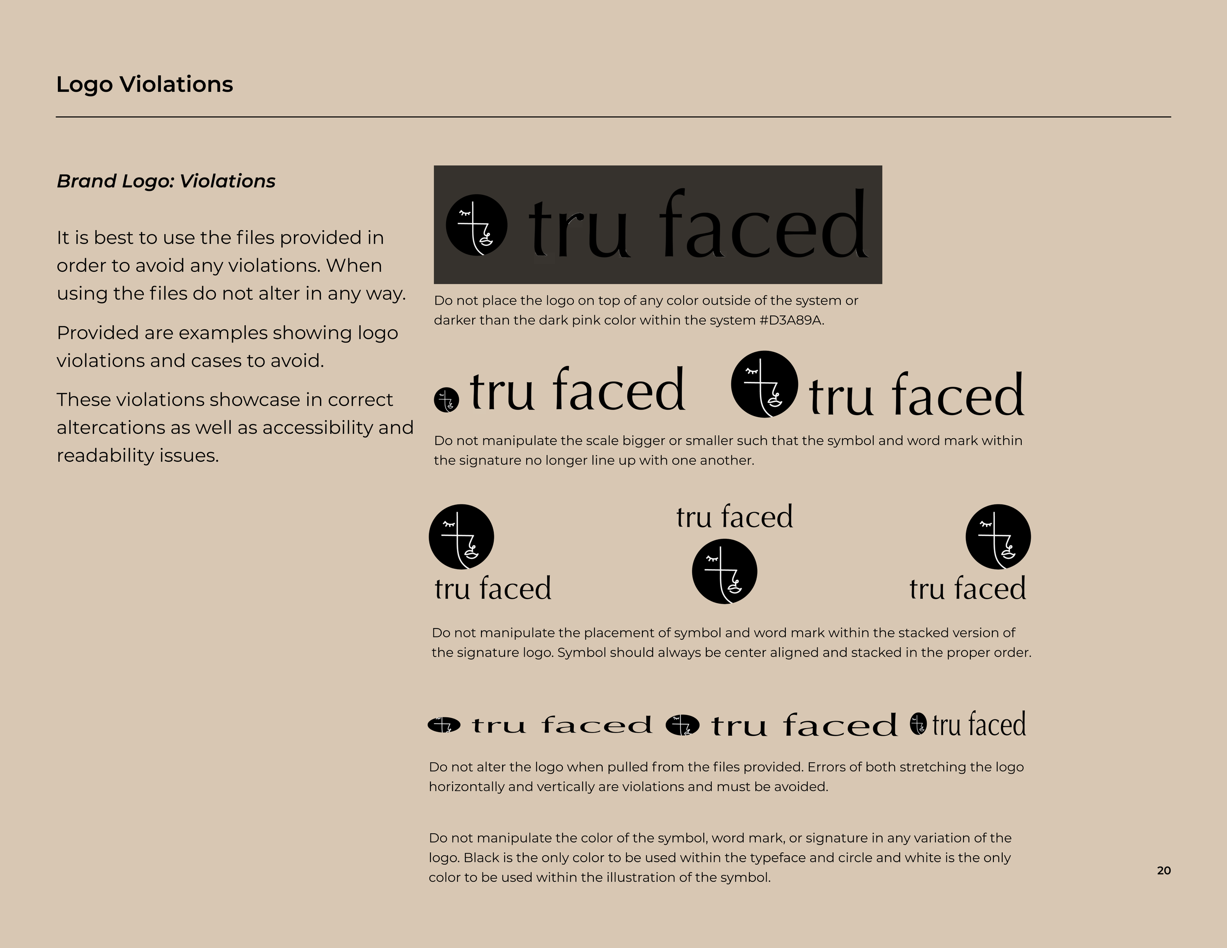
I proposed in each of the 3 BI’s that Too Faced rebrands to “Tru Faced” in order to better align and convey the brand story and values.
In presenting this to my Too Faced client, I would pitch all 3 options, highlighting the benefits of each and explaining my preferred option (leftmost option).
The leftmost option plays off the letter “t” and a elegantly lined faced. The circle that it sits in recalls a makeup pallet.
The middle option plays off of the heart brand element that is currently used frequently across Too Faced.
The rightmost option plays off the letter “t” and is meant to recall a makeup/eye shadow pallet. The white box is just there for contrast purposes.

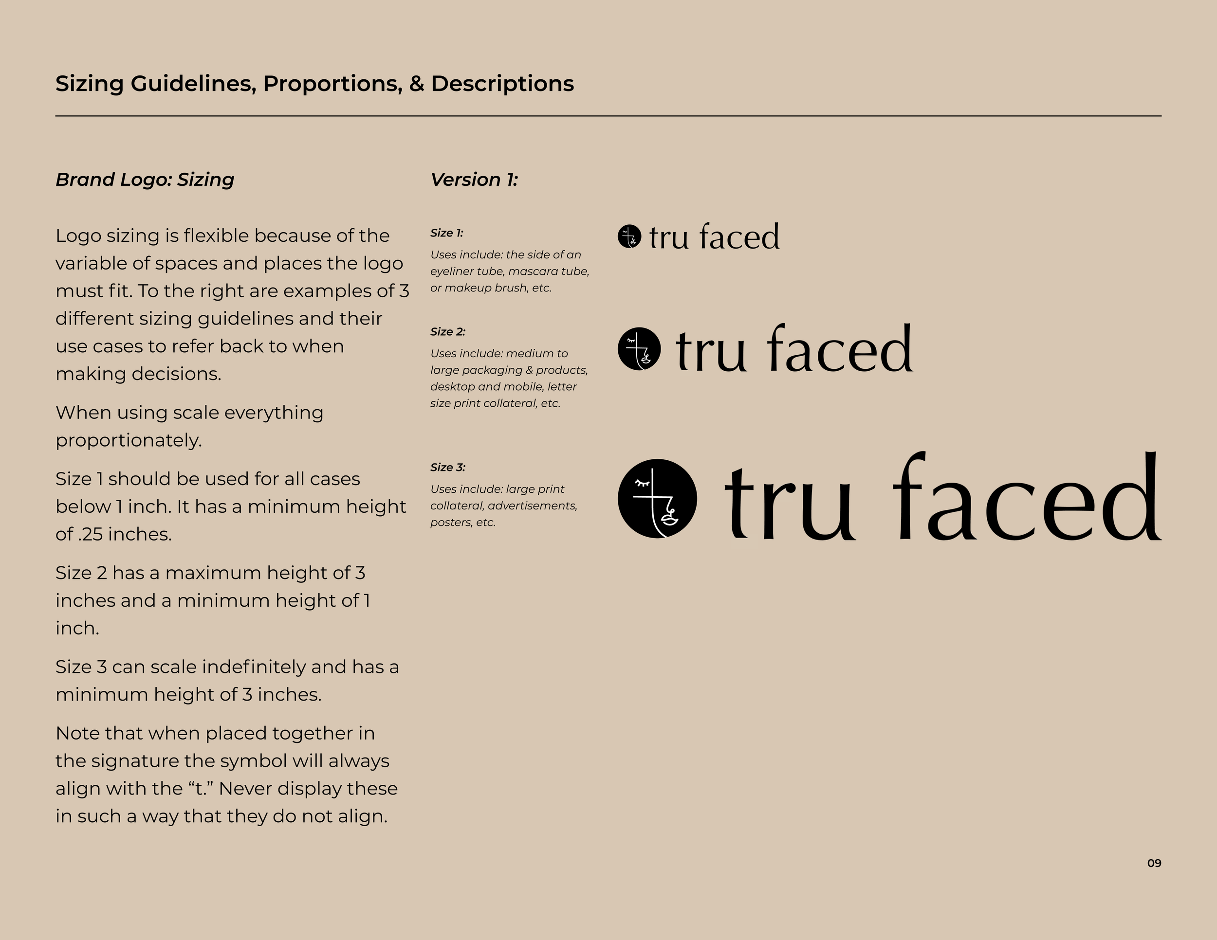
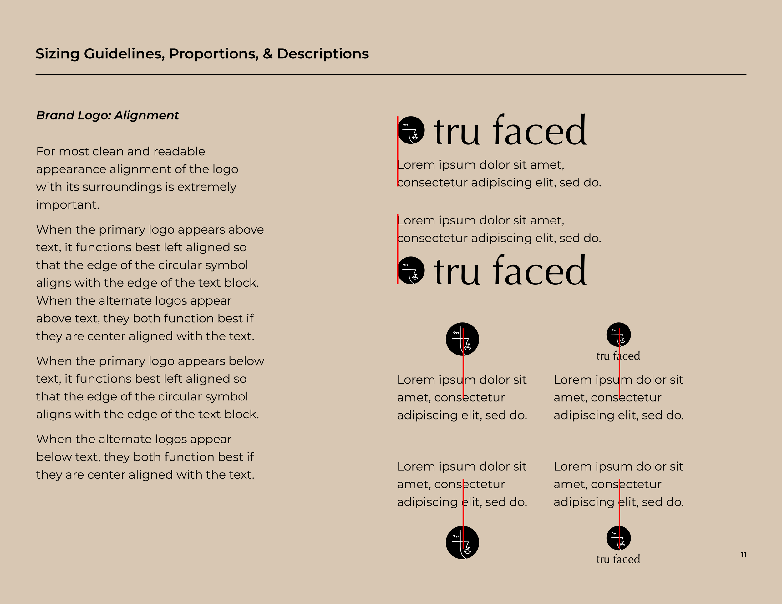
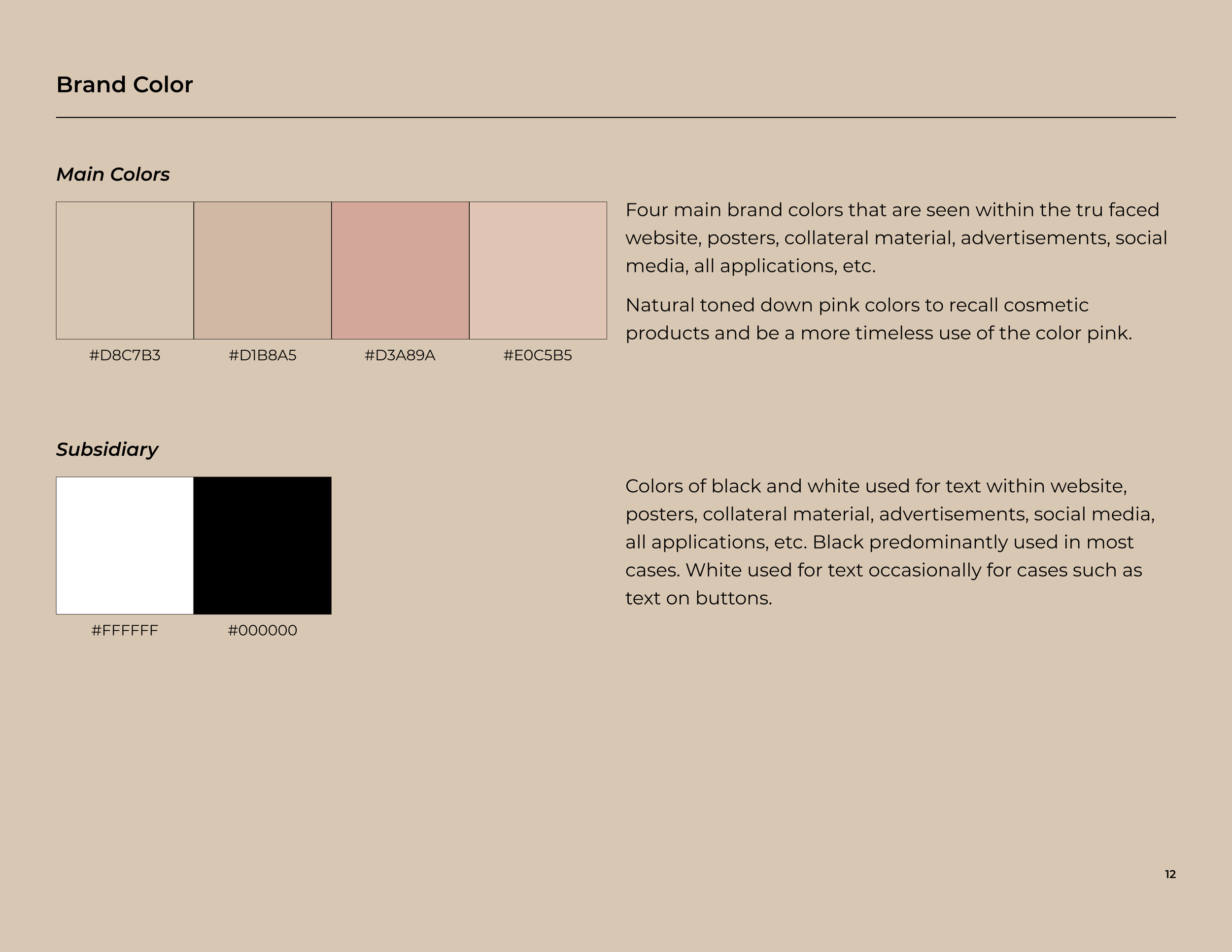
Brand Identity Process
Quickly calling out that throughout each of these steps, there was A LOT of iteration and sketches done in between! It was important to test out ideas both digitally and on paper. Visually a variety of ideas ultimately helps me land on the option that feels right. I also conducted an extensive type study, multiple mood boards, and found inspiration from brands that have a strong wordmark, symbol, and signature.
Brand Experience
My final step in my proposal was to showcase how I planned on introducing the rebranded Tru Faced to the world and visualizing what that experience would look like! I planned out ad campaigns, a launch day event, packaging, and web experience.
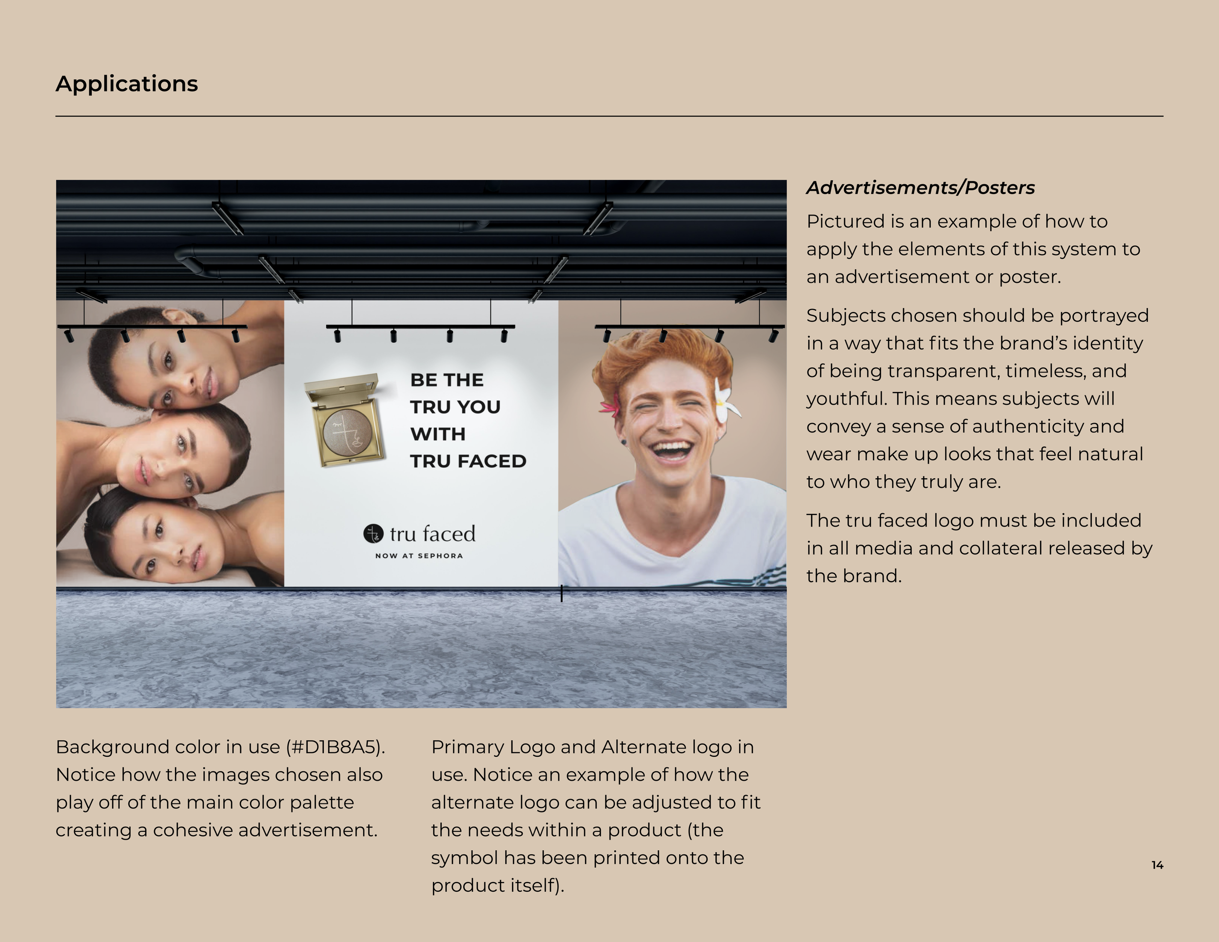
Ad on the left showcasing the authenticity found in the Tru Faced brand.


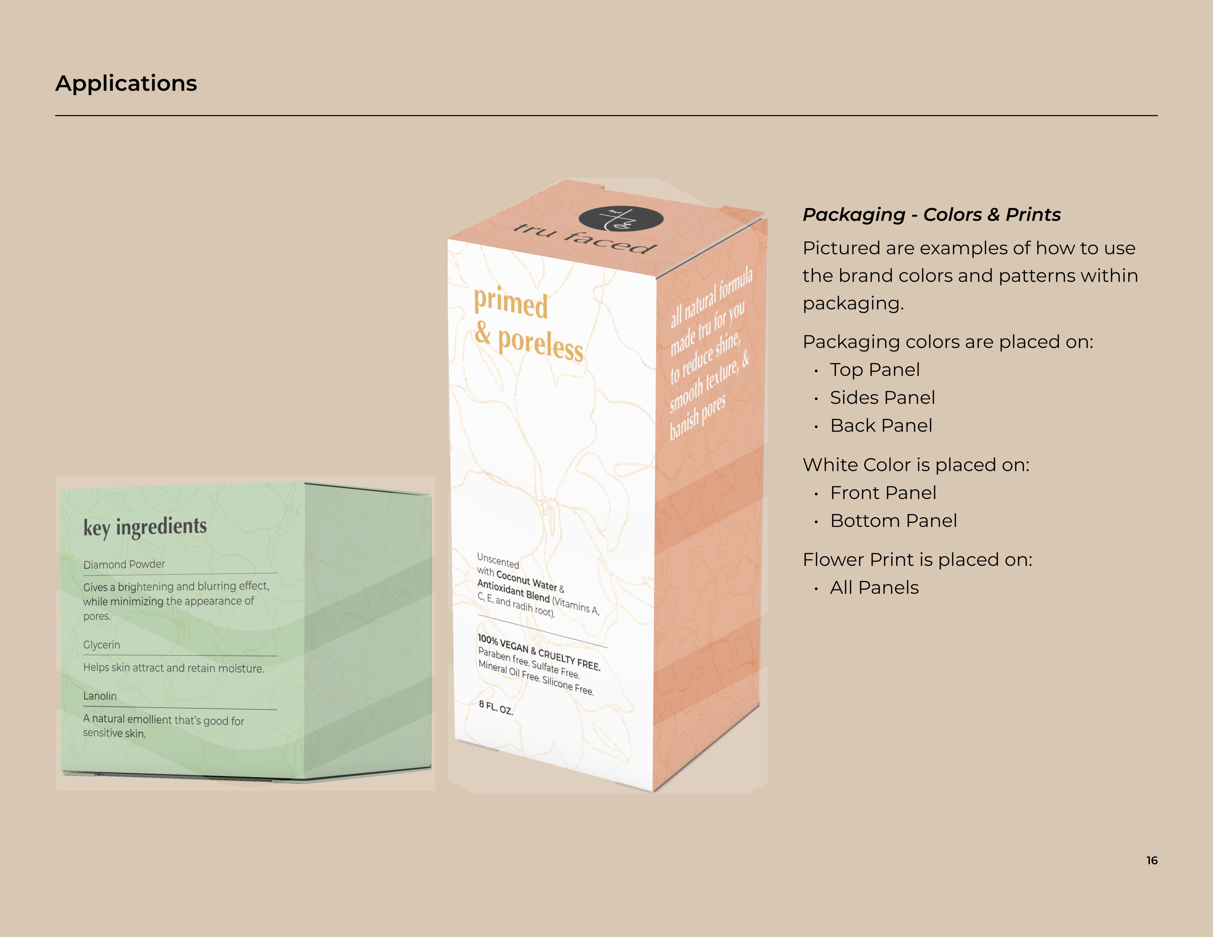
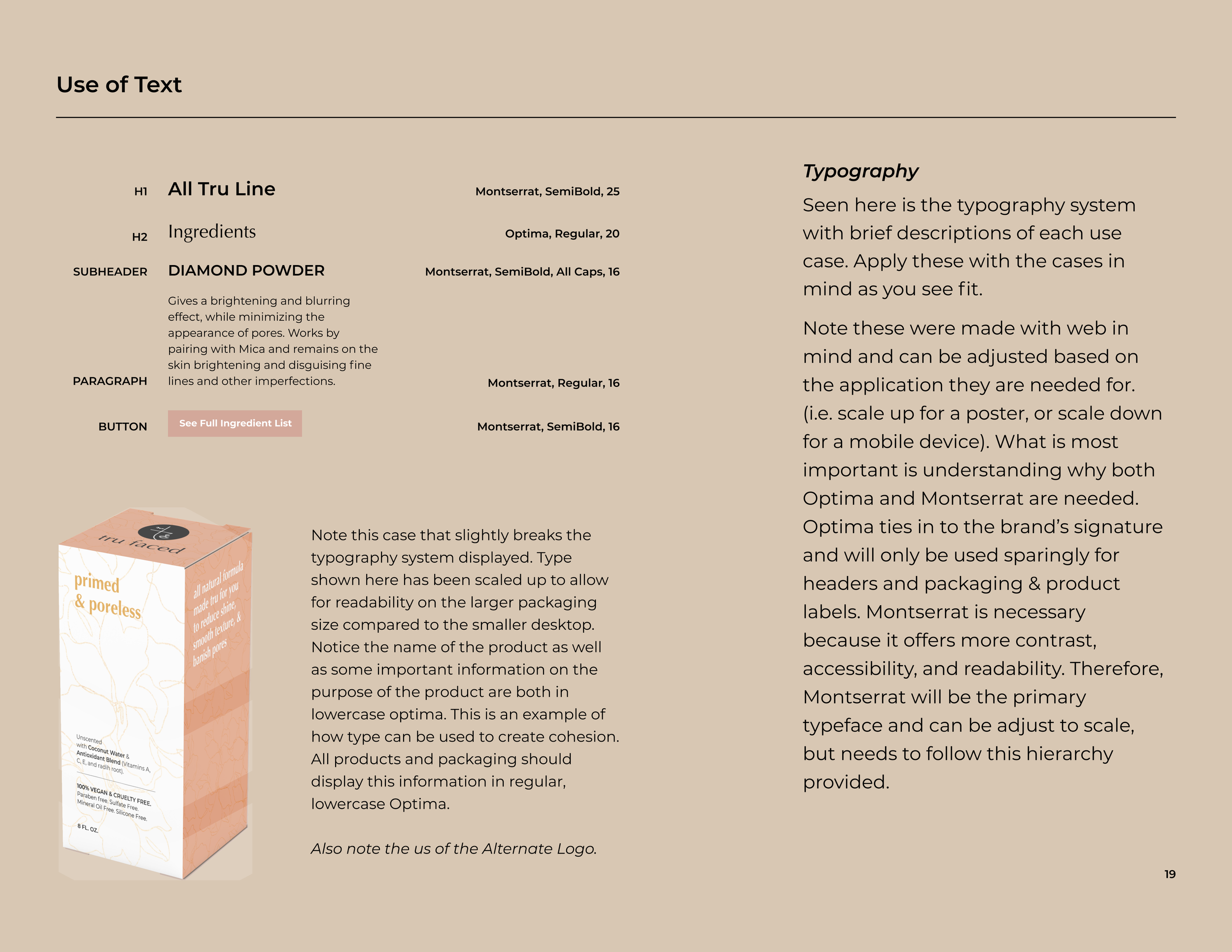
Building a cohesive experience across packaging. Extremely important in the rebrand as previous packaging was chaotic and always variable. This would be the generic branding used across all boxed products. Notice the use of a cohesive type system as well as consistent patterns on the packaging. I then used color to convey the youthfulness.

Along with the “standard packaging,” I explored how Tru Faced would incorporate there themed products. Seen here is an example of the design system the pallet products would follow.
The shift from everything being super crazy themed to only select lines aims to promote the brand values of timelessness and transparency.
As you can noticed even when themed, the brand feels cohesive and follows the same design system.
“Standard” packaging on the left, Themed packaging on the right.

Launch day experience! Planning out some decor and fun ball pit experience to get consumers excited and spread the word about the new Tru Faced. Goal was to create photo opt opportunities that could be shared on social media and pick up attention.

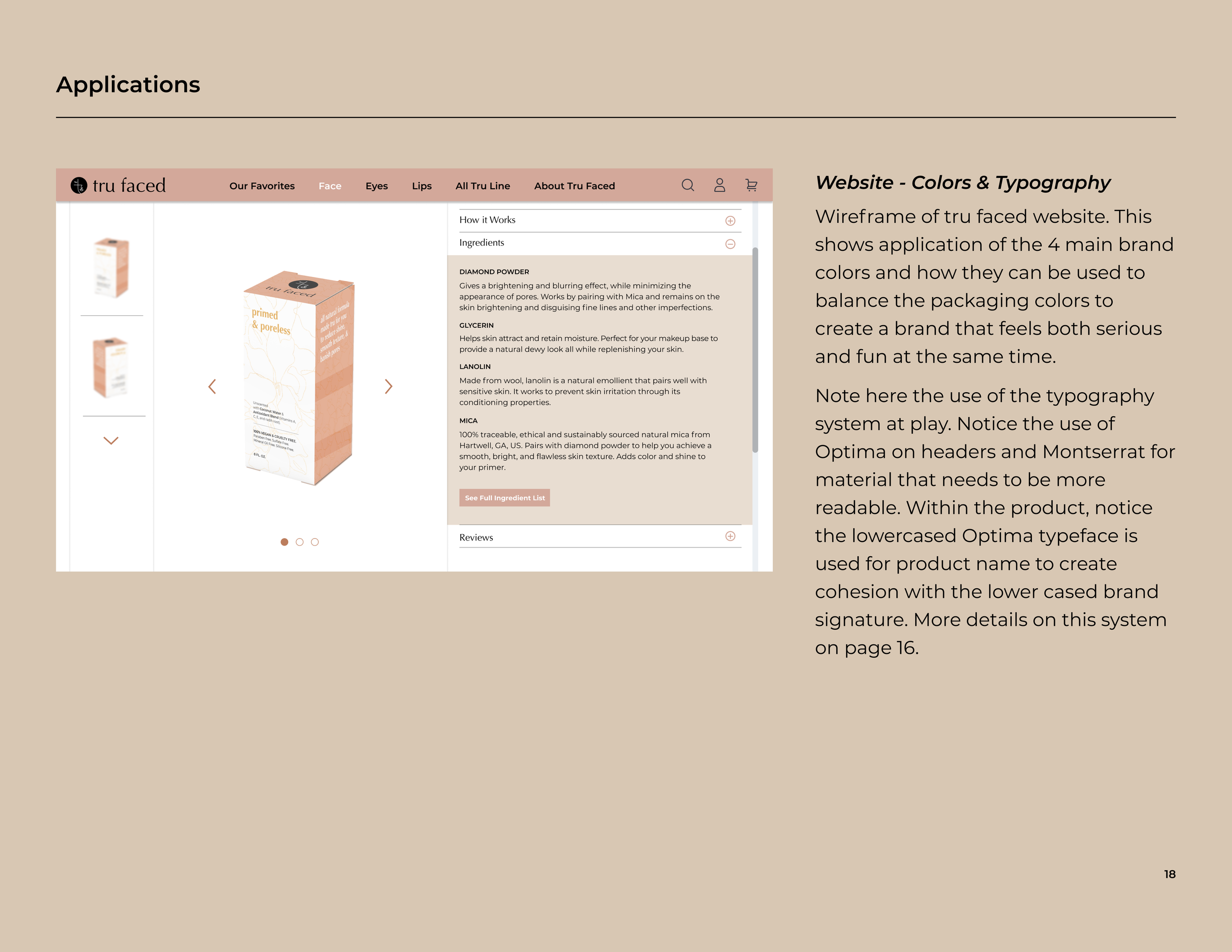
Finally, I quickly sketched up what I imagine the rebranded website to look like. It’s super important to highlight the display of ingredients, easy access to get more information on Tru Faced in the nav bar, and the All Tru Line page. My goal was to increase usability and help consumers immediately get answers to there questions. The All Tru Line page acts as an immediate filter that shows all the products that are organic and sustainably made. Ultimately serving as an attempt to begin the process of creating a more sustainable and ethical brand.
Brand Guidelines Book